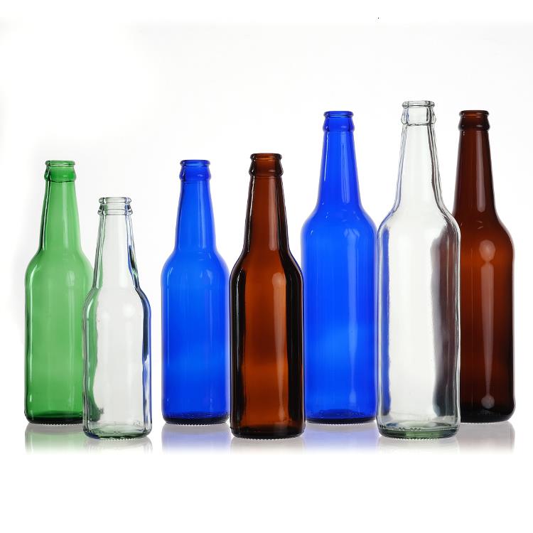
How to choose the right colors for your product packaging
How to choose the right colors for your product packaging?
Businesses need to take into consideration many different aspects of packaging. Choose the type of packaging for your product, decide on the size and shape of the package and design the logo and label. Some people overlook the importance of selecting colors for your packaging design.
Color is an important element in packaging. Many designers agree, but people continue to underestimate its importance. Over 85% of consumers state that color is a factor in their purchasing decisions. Choosing the right colors to use for your product packaging is crucial. We'll discuss the psychology behind color in packaging design, and how you can package your product to maximize visibility.

The Psychology of Color Usage in Packaging Design
Colors can evoke an emotional reaction. They affect our behavior and trigger psychological connections. Let's find out what feelings these colors usually evoke.It's important to note that shading and brightness also play a role, so don't take our descriptions too seriously. Brands should still be concerned about how their color packaging communicates the personality of the brand in a manner that encourages consumers to purchase the product.
White
White packaging design signifies simplicity, and our perception of such products leans towards safety or tradition. For example, numerous Apple products are crafted in white color palettes, accompanied by advertising that is both straightforward and refined. Apple aims to make consumers feel as though their products seamlessly integrate into everyday life, and the use of white colors embodies this concept.
Black
On the opposite end of the color spectrum, black packaging is frequently employed to evoke a sense of elegance or sophistication. This is why it is a favored choice for luxury brands such as Coach and Jaguar, among others. Moreover, incorporating black into your product packaging design can also convey to consumers that your products are robust and long-lasting. Consequently, athletic brands like Adidas often opt for black when designing customized product packaging.
Green
When deciding on how to package your product, green hues are an excellent choice for highlighting natural or organic brands. The fact that "going green" is synonymous with being environmentally friendly certainly adds to its appeal – this color prompts consumers to associate it with nature or earthiness. The next time you visit the grocery store, take a look at the organic foods section and try to spot a package that lacks any trace of green. Good luck, as you'll likely find it quite a challenge!
Yellow
The vibrancy of yellow packaging often evokes thoughts of enjoyable, light-hearted experiences, explaining why this color is so prevalent in custom product packaging targeted at younger audiences. For instance, consider the bright yellow hues commonly utilized in Lego branding. Additionally, it can be employed for products that seek to rejuvenate older individuals, like energy supplements.
Blue
Blue hues in product packaging design are frequently perceived as safe or even somewhat unexciting. As a highly common color in custom product packaging, blue can evoke feelings of reliability and honesty. While it may lack excitement, blue packages are often highly effective. Food and beverage brands frequently favor blue packaging – for instance, consider a Pepsi can or a Gerber baby food package.
Red
In stark contrast to the unassuming reliability of blue packaging, red product packaging design communicates a sense of exhilaration and vitality. This is the color you should choose if you aim to market a product that ignites passion in your customers. In this context, it is intriguing to compare the marketing strategies employed by Pepsi, with its "safe" blue packaging, and Coke, which is renowned for its brightly colored red can. Similar to blue hues, the specific shade of red you utilize in your product packaging design is crucial: darker reds suggest a more professional, polished product, whereas lighter reds convey a more youthful and exhilarating aura.
Combining Colors for Maximum Effect
By utilizing a specific color in your custom product packaging, you can convey a lot about your brand. Furthermore, blending multiple colors can craft a sophisticated message. Employing complementary colors can yield a harmonious aesthetic, whereas using contrasting colors can be stimulating – or perplexing if executed poorly. When incorporating multiple colors, ensure you comprehend how your selected hues will interact with each other (or clash, depending on the situation).
Conclusion
Choosing the right colors for your product isn’t always easy. Thankfully, IDEA Bottles is here to help. Feel free to reach out to our representatives, and we’ll be happy to discuss the many different colors of custom product packaging we have in our inventory.